CSS width and height properties are used to specify the size (width and height) of an element. For example,
h1 {
    width: 200px;
    height: 100px;
    background-color: orange;
}
Browser Output

Here, the h1 element has a width and height of 200px and 100px respectively.
CSS width/height Syntax
The syntax of width and height properties is as follows:
width/height: auto | length | percentage | initial | inherit;
Here,
auto: browser calculates the height and width (default value)length: defines the height/width in px, cm, etcpercentage: defines the width and height using percentage(%) valueinitial: sets the height/width to its default valueinherit: inherits the value from its parent element
The width and height of an element can be set in absolute and relative units.
Absolute units are fixed measurements that do not change with respect to other elements, while relative units are based on the size of parent elements.
Example: CSS auto Value
Let's see an example using the auto value,
<!DOCTYPE html>
<html lang="en">

    <head>
        <meta charset="UTF-8" />
        <meta name="viewport" content="width=device-width, initial-scale=1.0" />
        <link rel="stylesheet" href="style.css" />
        <title>CSS width/height</title>
    </head>

    <body>
        <div>This div element has the width and height set to auto.</div>
        <span>This span element has the width and height set to auto.</span>
    </body>

</html>
div {
    width: auto;
    height: auto;
    background-color: skyblue;
    margin-bottom: 12px;
}

span {
    width: auto;
    height: auto;
    background-color: gold;
}
Browser Output

In the above example,
- the block-level element
divexpands the width to fill the entire horizontal space till the corner - the inline-level element
spanadjusts width based on the content length
CSS Absolute Width and Height Example
Let's see an example,
<!DOCTYPE html>
<html lang="en">

    <head>
        <meta charset="UTF-8" />
        <meta name="viewport" content="width=device-width, initial-scale=1.0" />
        <link rel="stylesheet" href="style.css" />
        <title>CSS width/height</title>
    </head>

    <body>
        <div class="first">
            This div element has a width of 600px and a height of 40px.
        </div>

        <div class="second">
            This div element has a width of 300px and a height of 80px.
        </div>
    </body>

</html>
div.first {
    width: 600px;
    height: 40px;
    background-color: skyblue;
}

div.second {
    width: 300px;
    height: 80px;
    background-color: gold;
}
Browser Output

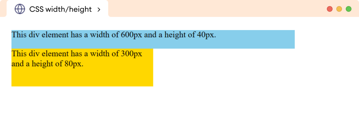
In the above example, the absolute unit pixel(px) causes the div elements to have the same width and height regardless of the screen size or resolution.
CSS Relative Width and Height Example
Let's see an example,
<!DOCTYPE html>
<html lang="en">

    <head>
        <meta charset="UTF-8" />
        <meta name="viewport" content="width=device-width, initial-scale=1.0" />
        <link rel="stylesheet" href="style.css" />
        <title>CSS width/height</title>
    </head>

    <body>
        <p>This outer paragraph has both a width and a height of 50%.</p>

        <div>
            <p>This inner paragraph has both a width and a height of 50%.</p>
        </div>
    </body>
</html>
/* specifying the width and height of the body */
body {
    width: 100%;
    height: 300px;
}

/* adds 50% width and height to both p elements */
p {
    width: 50%;
    height: 50%;
    background-color: skyblue;
}

div {
    width: 50%;
    height: 50%;
    background-color: gold;
}
Browser Output

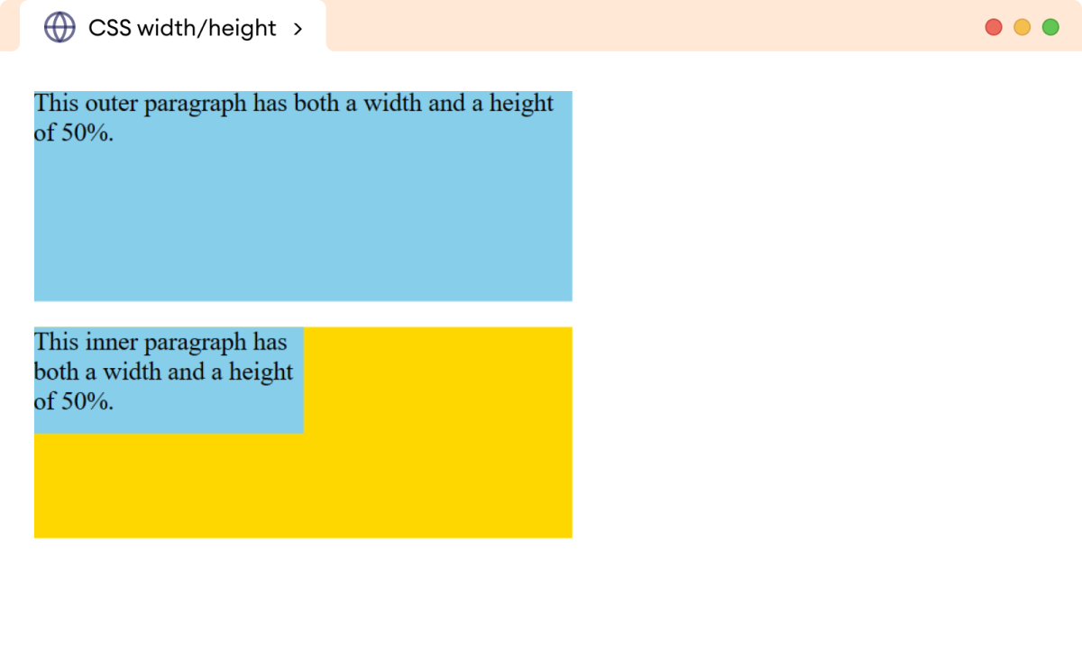
In the above example, the p element has a different output even though both elements have the same styles.
This is because the width and height are calculated relative to the width and height of the element's parent element.
The width and height of the first paragraph are calculated relative to the size of the parent, i.e., body element while the width and height of the second paragraph are calculated relative to the div element.
Setting Width And Height with Inline Elements
We cannot add the width and height to inline elements. For example,
<!DOCTYPE html>
<html lang="en">

    <head>
        <meta charset="UTF-8" />
        <meta name="viewport" content="width=device-width, initial-scale=1.0" />
        <link rel="stylesheet" href="style.css" />
        <title>CSS width/height</title>
    </head>

    <body>
        <span>This is a span element.</span>
    </body>

</html>
span {
    width: 300px;
    height: 100px;
    background-color: skyblue;
}
Browser Output

In the above example, the width and height properties are ignored by the browser.
This is because inline elements are designed to flow along with the text, and their size is determined by the content of the element.
However, we can add width and height by setting the display property of the inline element to the block or inline-block. For example,
<!DOCTYPE html>
<html lang="en">

    <head>
        <meta charset="UTF-8" />
        <meta name="viewport" content="width=device-width, initial-scale=1.0" />
        <link rel="stylesheet" href="style.css" />
        <title>CSS width/height</title>
    </head>

    <body>
        <span>This is a span element.</span>
    </body>

</html>
span {
    display: inline-block;
    width: 300px;
    height: 100px;
    background-color: skyblue;
}
Browser Output

In the above example, the width and height values are applied to the span element.
Note: The height and width properties are applied only to the content of the element, excluding the border, padding, and margin of the element. This behavior can be changed using the box-sizing property.
Problem with Absolute Width
The absolute width value causes the element to have a fixed width regardless of the screen size or device being used to view the webpage.
This can cause issues such as elements overflowing, content being cut off, or the layout not adapting well to different screen sizes.
Let's see an example,
<!DOCTYPE html>
<html lang="en">

    <head>
        <meta charset="UTF-8" />
        <meta name="viewport" content="width=device-width, initial-scale=1.0" />
        <link rel="stylesheet" href="style.css" />
        <title>CSS width</title>
    </head>

    <body>
        <p>
            In the world of computer science, the path of discovery is paved
            with lines of code, each representing a stroke of genius, a eureka
            moment captured in a digital form.
        </p>
    </body>

</html>
p {
    width: 1020px;
}
Browser Output

In the above example, the width of the p element is 1020px. As the browser size is reduced to 760px, the content is cut off, resulting in incomplete information.
The max-width property is commonly used to solve this issue.
The max-width property defines the maximum width an element can have, allowing it to be more flexible and responsive with a smaller width.
Let's see an example,
<!DOCTYPE html>
<html lang="en">

    <head>
        <meta charset="UTF-8" />
        <meta name="viewport" content="width=device-width, initial-scale=1.0" />
        <link rel="stylesheet" href="style.css" />
        <title>CSS max-width</title>
    </head>

    <body>
        <p>
            In the world of computer science, the path of discovery is paved
            with lines of code, each representing a stroke of genius, a eureka
            moment captured in a digital form.
        </p>
    </body>

</html>
p {
    max-width: 1020px;
}
Browser Output

Here, the max-width property causes the p element to be flexible for the smaller browser size making the content property visible.