CSS font-size property adjusts the size of the text on the webpage. For example,
p {
    font-size: 36px;
}
Browser Output

Here, font-size: 36px sets the font size of p element to 36px.
CSS Font Size Syntax
The font-size property has the following syntax,
font-size: predefined keyword|length|initial|inherit;
Here,
- predefined keyword: Refers to the keyword that has predetermined
font-sizelikesmall,medium,large, etc. - length: Refers to the
font-sizeusing a specific length unit likepx,emor points.like24px,2em, etc.
The possible values for font-size are as follows,
| Values | Description |
|---|---|
xx-small |
displays the extremely small text size |
x-small |
displays the extra small text size |
small |
displays small text size |
medium |
displays medium text size |
large |
displays large text size |
x-large |
displays extra large text size |
xx-large |
displays extremely large text size |
xx-small |
displays the extremely small text size |
x-small |
displays the extra small text size |
smaller |
displays relatively smaller text size |
larger |
displays relatively larger text size |
initial |
sets the font size to the default value |
inherit |
inherits the font size from the parent element |
Absolute and Relative Values
CSS font-size can be specified as,
- Absolute value
- Relative value
1. Font Size Using Absolute Value
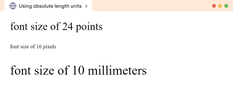
Absolute value sets the size to the fixed specified value. They are specified in specific length values, such as pixels(px), points(pt), etc. For example,
<!DOCTYPE html>
<html lang="en">
    <head>
        <meta charset="UTF-8" />
        <meta name="viewport" content="width=device-width, initial-scale=1.0" />
        <link rel="stylesheet" href="style.css" />
        <title>Using absolute length units</title>
    </head>

    <body>
        <p class="first_paragraph">font size of 24 points</p>
        <p class="second_paragraph">font size of 16 pixels</p>
        <p class="third_paragraph">font size of 10 millimeters</p>
    </body>
</html>
p.first_paragraph {
    /* sets the font size to 24 points */
    font-size: 24pt;
}
p.second_paragraph {
    /* sets the font size to 16 pixels */
    font-size: 16px;
}

p.third_paragraph {
    /* sets the font size to 10 millimeters */
    font-size: 10mm;
}
Browser Output

Note: Pixels (px) is commonly used as an absolute font size unit on the web. Pixels provide a consistent and precise way to specify font sizes that are not affected by the user's preferences or the device's resolution.
2. Font Size Using Relative Value
Relative value sets the size relative to its parent elements.
Relative values are specified using the keyword and percentage values. For example,
<!DOCTYPE html>
<html lang="en">
    <head>
        <meta charset="UTF-8" />
        <meta name="viewport" content="width=device-width, initial-scale=1.0" />
        <link rel="stylesheet" href="style.css" />
        <title>Using em</title>
    </head>

    <body>
        <h1>Normal  heading</h1>
        <div>
            <h1>Heading with em</h1>
            <p>This is some example text.</p>
        </div>
    </body>
</html>
div {
    font-size: 20px;
}
div h1 {
    font-size: 1.25em;
}
Browser Output

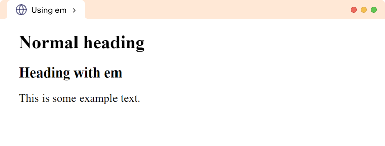
In the above example, we have two <h1> elements, one outside <div> element and the other inside of <div> element. The first <h1> element has the default size whereas the second <h1> element has a font-size of 1.25em, which is relative to the font-size of its parent element <div>.
The <div> has a font-size of 20px, so the font-size of <h1> inside <div> will be 1.25 times 20px, which equals 25px.
Frequently Asked Questions
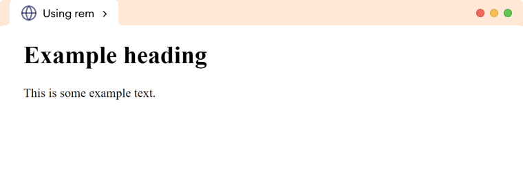
While em is based on the font-size of the parent element, rem is based on the font-size set in the root element html. For example,
<!DOCTYPE html>
<html lang="en">
    <head>
        <meta charset="UTF-8" />
        <meta name="viewport" content="width=device-width, initial-scale=1.0" />
        <link rel="stylesheet" href="style.css" />
        <title>Using rem</title>
    </head>

    <body>
        <h1>Example heading</h1>
        <p>This is some example text.</p>
    </body>
</html>
html {
    /*set the font size to 18px,
    default would be 16px */
    font-size: 18px;
}

h1 {
    /*sets font-size to 2 * 18px = 36px*/
    font-size: 2rem;
}

p {
    /* sets font-size to 18px */
    font-size: 1rem;
}
Browser Output

<!DOCTYPE html>
<html lang="en">
    <head>
        <meta charset="UTF-8" />
        <meta name="viewport" content="width=device-width, initial-scale=1.0" />
        <link rel="stylesheet" href="style.css" />
        <title>Using percentage</title>
    </head>

    <body>
        <h1>Relative font size</h1>
        <div>
            <h1>Example Heading</h1>
            <p>This is some example text.</p>
        </div>
    </body>
</html>
/*sets div font size to 20px */
.div {
    font-size: 20px;
}

/*sets h1 font size to 120% */
div h1 {
    font-size: 120%;
}
Browser Output

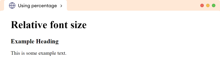
In the above example, the font-size of the first <h1> element is not set explicitly, so it uses the default size.
The second <h1> element has a font-size of 120%, which is relative to its parent element. The parent element <div> has a font-size of 20px, so the second <h1> element will have a font size of 120% of 20px which equals 24px.