The CSS float property allows us to position the elements on the left or right side of the container or parent element. The element gets moved from the normal flow allowing the succeeding elements to wrap up the floated element.
The float property can have one of the following values:
none: element doesn't float (default value)left: element moves on the left side of its containing blockright: element moves on the right side of its containing blockinitial: the value is set to the default valueinherit: inherits floating property from its parent element
The float property can be used to create various layout designs, text wrapping around an image, multi-column layouts, and the image gallery.
Let's look into a few layouts with the help of the float property.
Wrapping the text around the Image
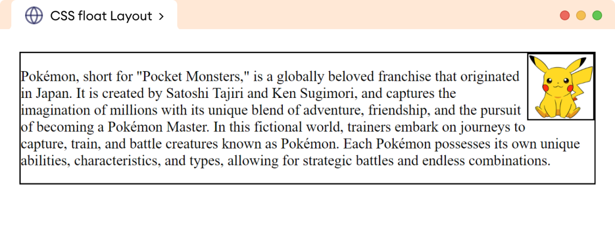
The float property is primarily used to wrap the text around the image, creating an elegant look. For example,
<!DOCTYPE html>
<html lang="en">
    <head>
        <meta charset="UTF-8" />
        <meta name="viewport" content="width=device-width, initial-scale=1.0" />
        <link rel="stylesheet" href="style.css" />
        <title>CSS float Layout</title>
    </head>

    <body>
        <div class="parent">
            <img
                src="https://freepngimg.com/thumb/pokemon/37475-6-pikachu-transparent-image-thumb.png"
                alt="Pokemon Picture"
            />
            <p>
                Pokémon, short for "Pocket Monsters," is a globally beloved
                franchise that originated in Japan. It is created by Satoshi
                Tajiri and Ken Sugimori, and captures the imagination of
                millions with its unique blend of adventure, friendship, and the
                pursuit of becoming a Pokémon Master. In this fictional world,
                trainers embark on journeys to capture, train, and battle
                creatures known as Pokémon. Each Pokémon possesses its own
                unique abilities, characteristics, and types, allowing for
                strategic battles and endless combinations.
            </p>
        </div>
    </body>
</html>
img {
    /* floats the image to the right */
    float: right;

    width: 80px;
    height: 80px;
    border: 2px solid black;
}

div.parent {
    border: 2px solid black;
}
Browser Output

In the above example, float: right pushes the image from the normal flow to the right of the parent div element.
Creating an Image Gallery
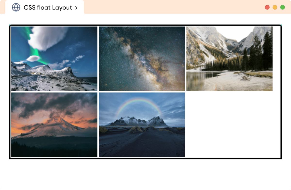
The float property can also be used to create a responsive image gallery. For example,
<!DOCTYPE html>
<html lang="en">

    <head>
        <meta charset="UTF-8" />
        <meta name="viewport" content="width=device-width, initial-scale=1.0" />
        <link rel="stylesheet" href="style.css" />
        <title>CSS float Layout</title>
    </head>

    <body>
        <div class="parent">
            <img  src="https://images.pexels.com/photos/3408744/pexels-photo-3408744.jpeg"
                alt="Northern Winter Sky Image"/>
            <img  src="https://images.pexels.com/photos/1142950/pexels-photo-1142950.jpeg"
                alt="Shining Stars Image"/>
            <img  src="https://images.pexels.com/photos/3933881/pexels-photo-3933881.jpeg"
                alt="A River Flowing Image"/>
            <img src="https://images.pexels.com/photos/5409751/pexels-photo-5409751.jpeg"
                alt="A cloudy Mountain Image"/>
            <img  src="https://images.pexels.com/photos/4101555/pexels-photo-4101555.jpeg"
                alt="A Winter Rainbow Image"/>
        </div>
    </body>
</html>
img {
    /* floats all the images to the left */
    float: left;

    width: 240px;
    height: 180px;
    margin: 2px;
}

div.parent {
    border: 4px solid black;
    overflow: auto;
}
Browser Output

In the above example,
float: left;
Pushes images to the left of the parent div element and creates an image gallery.
Creating three Column Layouts
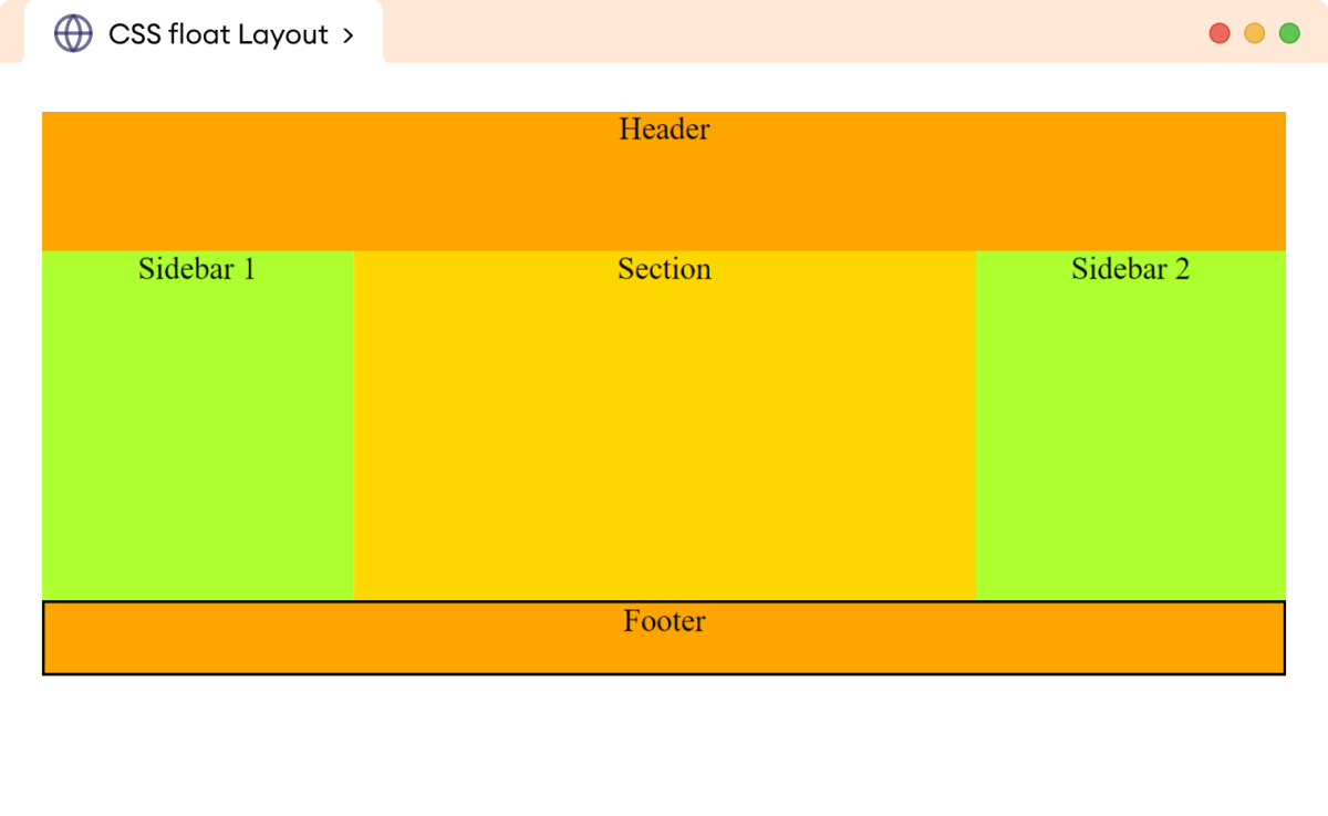
The float property can be used to create a popular three-column layout on the webpage. For example,
<!DOCTYPE html>
<html lang="en">

    <head>
        <meta charset="UTF-8" />
        <meta name="viewport" content="width=device-width, initial-scale=1.0" />
        <link rel="stylesheet" href="style.css" />
        <title>CSS float Layout</title>
    </head>

    <body>
        <header>Header</header>

        <!-- Creating three column-based layout -->

        <main>
            <aside class="left">Sidebar 1</aside>
            <section>Section</section>
            <aside class="right">Sidebar 2</section>
        </main>

        <footer>Footer</footer>
    </body>
</html>
header {
    height: 80px;
    background-color: orange;
    text-align: center;
}

aside {
    width: 25%;

    /* floats both sidebar to left */
    float: left;
    height: 200px;
    background-color: greenyellow;
    text-align: center;
}

section {
    /* floats the section to the left */
    float: left;

    width: 50%;
    height: 200px;
    background-color: gold;
    text-align: center;
}

footer {
    /* moves the footer below the floated elements, else
    footer starts behind the floated elements */
    clear: both;

    border: 2px solid black;
    height: 40px;
    background-color: orange;
    text-align: center;
}
Browser Output

In the above example, the float property is used to create a three-column-based layout on a webpage.
The three columns of aside and section elements float next to each other with the float: left. The order of floating elements remains the same as their order in the HTML document.
The clear property is used with the footer element to push it below the floated element.
The float property was initially intended to be used for wrapping text around an image. However, developers discovered they could utilize floats to achieve complex layouts and started creating layouts using the float property.
Before float-based layouts, tables were used to create layouts of the webpage.
Modern CSS offers flexbox and grid properties to create complex layouts and float-based layouts are considered outdated.
Note: The CSS clear property adjusts the behavior of adjacent elements allowing to turn off the wrapping around the floating element.