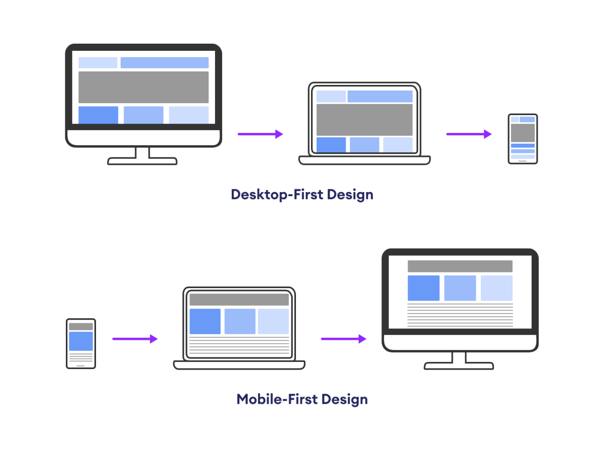
Mobile-first design is an approach to designing websites and apps that prioritizes the mobile experience first.
This means that the design is optimized for mobile devices and then adapted to larger screens such as desktops and laptops.
The following diagram shows the mobile-first and desktop-first approaches to design.

Due to the surge in smartphone and tablet usage for online browsing, mobile-first design has become increasingly prominent.
Designing the Mobile First
In the mobile-first design, we start by writing our CSS for mobile devices and then use media queries to add style for larger devices like tablets and desktops.
In this approach, media queries are used with min-width property. For example,
/* mobile styles (default) */
body {
    font-size: 16px;
    padding: 10px;
}

/* media query for tablets and larger screens */
@media (min-width: 768px) {
    body {
        font-size: 18px; /* Increase font size for larger screens */
        padding: 20px;
    }
}
In the above example,
- First, the styles are defined for mobile devices, with a basic layout and font size.
- Then, a media query is used to adjust styles for tablets (
min-width: 768px) by increasing the font size and modifying padding.
Advantages of Mobile First Design
The advantages of mobile-first design are as follows:
1. Improved User Experience
Mobile-first design ensures that our website is optimized for smartphones which leads to faster load times, better touch-friendly interactions, and a more satisfying experience for mobile users.
2. Faster Page Loading
Prioritizing mobile design encourages a focus on essential content and efficient code. This results in smaller file sizes and faster page loading times, benefiting both mobile and desktop users.
3. Enhanced SEO
Search engines favor mobile-friendly websites, so starting with a mobile-first design can boost our SEO rankings and visibility, ultimately attracting more organic traffic.
4. Scalability
Mobile-first designs provide a solid foundation for scaling up to larger screens, making the transition to tablets and desktops smoother and more efficient.
5. Accessibility
A mobile-first approach encourages accessible design principles, ensuring that your website is usable by a broader range of users, including those with disabilities.
6. Simplified Maintenance
Starting with a streamlined mobile design can lead to cleaner and more maintainable code, making ongoing updates and enhancements easier to implement.