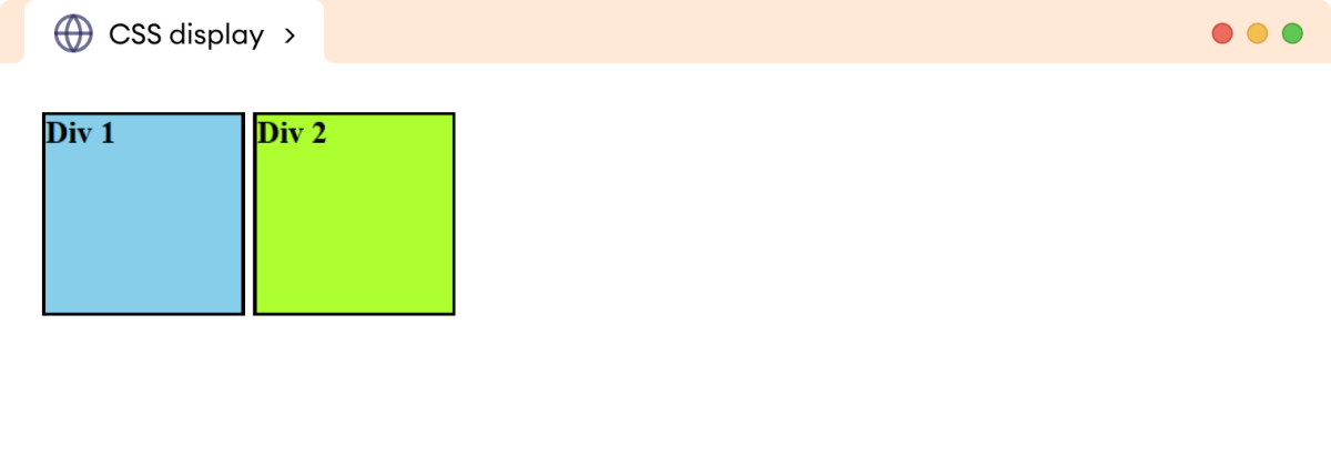
The CSS display property is used to adjust the layout of an element. For example,
div {
    display: inline-block;
}
Browser Output

Here, the inline-block value of the display property adds both div elements in the same horizontal flow. By default, the block-level elements like div, h1, etc., start a new line and take full width.
The display property allows changing the display behavior of inline and block elements.
CSS Display Syntax
The syntax of the display property is as follows:
display: value;
The commonly used values for the display property are as follows:
inline: allows an element to behave like an inline-level elementblock: allows an element to behave like a block-level elementinline-block: formats the element as inline-level but also allows to set height/width like block-level elementflex: sets the element as a flex container to have a flexible layout of its child elementsgrid: sets the element as a grid container to create complex layoutsnone: removes the element from the document leaving no space
CSS Display Inline
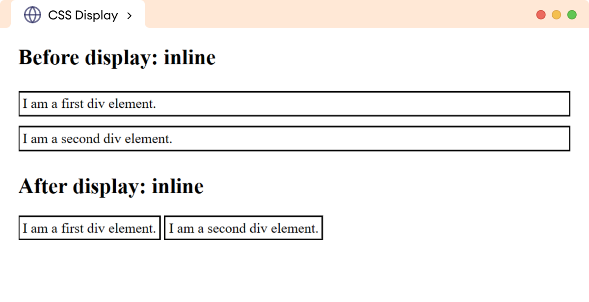
The inline value of the display property allows a block-level element to behave like an inline element. The inline elements occupy only the required width for their content.
Let's see an example,
<!DOCTYPE html>
<html lang="en">

    <head>
        <meta charset="UTF-8" />
        <meta name="viewport" content="width=device-width, initial-scale=1.0" />
        <link rel="stylesheet" href="style.css" />
        <title>CSS Display</title>
    </head>

    <body>
        <h2>Before display: inline</h2>
        <div>I am a first div element.</div>
        <div>I am a second div element.</div>

        <!-- Adding display: inline in divs -->

        <h2>After display: inline</h2>
        <div class="after">I am a first div element.</div>
        <div class="after">I am a second div element.</div>
    </body>

</html>
div {
    border: 2px solid black;
    margin-bottom: 12px;
    padding: 4px;
}

div.after {
    display: inline;
}
Browser Output

In the above example, the inline value causes the block-level element div to behave like an inline element.
Hence, it takes as much width as required and doesn't start on a new line.
CSS Display Block
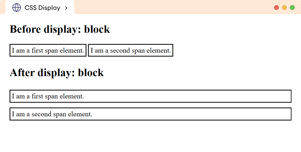
The block value of the display property causes an inline element to behave like a block element. For example,
<!DOCTYPE html>
<html lang="en">

    <head>
        <meta charset="UTF-8" />
        <meta name="viewport" content="width=device-width, initial-scale=1.0" />
        <link rel="stylesheet" href="style.css" />
        <title>CSS Display</title>
    </head>

    <body>
        <h2>Before display: block</h2>
        <span>I am a first span element.</span>
        <span>I am a second span element.</span>

        <!-- Adding display: block in spans-->

        <h2>After display: block</h2>
        <span class="after">I am a first span element.</span>
        <span class="after">I am a second span element.</span>
    </body>

</html>
span {
    border: 2px solid black;
    margin-bottom: 12px;
    padding: 4px;
}

span.after {
    display: block;
}
Browser Output

In the above example, the block value causes the inline-level element span to behave like a block element.
Hence, it starts on a new line and covers the entire width.
CSS Display Inline Block
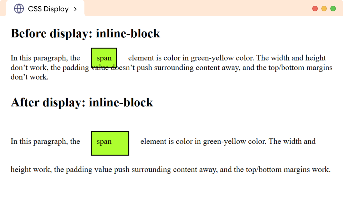
The inline-block value of the display property combines characteristics of inline and block elements.
When an element is set to inline-block,
- It flows like an inline element allowing other elements to flow around horizontally.
- It accepts the
widthandheightproperties. (By default, width and height don't work in inline elements.) - It accepts the
paddingandmarginvalues. (By default, top and bottom margins don't work for inline elements, and padding also doesn't push other elements away.)
Let's see an example,
<!DOCTYPE html>
<html lang="en">

    <head>
        <meta charset="UTF-8" />
        <meta name="viewport" content="width=device-width, initial-scale=1.0" />
        <link rel="stylesheet" href="style.css" />
        <title>CSS Display</title>
    </head>

    <body>
        <h2>Before display: inline-block</h2>
        <p>
            In this paragraph, the <span>span</span> element is color in
            green-yellow color. The width and height don't work, the padding
            value doesn't push surrounding content away, and the top/bottom
            margins don't work.
        </p>

        <!-- Adding display: inline-block the divs -->

        <h2>After display: inline-block</h2>
        <p>
            In this paragraph, the <span class="after">span</span> element is
            color in green-yellow color. The width and height work, the padding
            value push surrounding content away, and the top/bottom margins
            work.
        </p>
    </body>

</html>
span {
    width: 60px;
    height: 30px;
    padding: 10px;
    margin: 20px;

    border: 2px solid black;
    background-color: greenyellow;
}

span.after {
    display: inline-block;
}
Browser Output

CSS Display Flex
The flex value of the display property allows for efficient alignment and distribution of the space between the child elements within the parent element.
Let's see an example,
<!DOCTYPE html>
<html lang="en">

    <head>
        <meta charset="UTF-8" />
        <meta name="viewport" content="width=device-width, initial-scale=1.0" />
        <link rel="stylesheet" href="style.css" />
        <title>CSS Display</title>
    </head>

    <body>
        <ul class="parent">
            <li>Home</li>
            <li>About</li>
            <li>Gallery</li>
            <li>Blogs</li>
            <li>Contact</li>
        </ul>
    </body>

</html>
ul.parent {
    display: flex;
    background-color: greenyellow;
    padding: 0px;
}

li {
    background: skyblue;
    border: 1px solid black;
    padding: 12px;
    margin: 8px;
    list-style: none;
}
Browser Output

In the above example, the flex value of the display property aligns the li elements in a horizontal layout.
Note: Flex is a powerful tool for creating a flexible and responsible layout. It encompasses a range of associated properties and values that enable the creation of complex layouts.
We will read about flex layout in the coming tutorials.
CSS Display None
The none value of the display property is used to hide an element and remove it from the normal flow of the document.
Let's see an example,
<!DOCTYPE html>
<html lang="en">

    <head>
        <meta charset="UTF-8" />
        <meta name="viewport" content="width=device-width, initial-scale=1.0" />
        <link rel="stylesheet" href="style.css" />
        <title>CSS Display</title>
    </head>

    <body>
        <h1>Heading: CSS Display Property</h1>
        <p>
            The display: none hides the element and removes the space from the
            document.
        </p>
    </body>

</html>
h1 {
    border: 2px solid black;
    background-color: greenyellow;
}
Browser Output

In the above example, if we add
h1 {
    display: none;
}
Then the browser output will be,

Here, h1 is hidden, and the space is removed from the document.