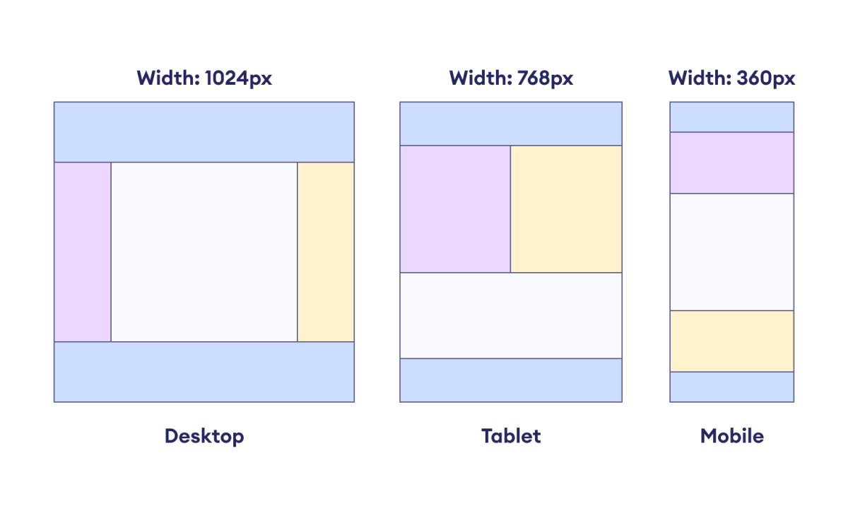
CSS media query is a CSS rule that allows us to apply different styles to the webpage depending on the user's device or screen size.
The following diagram shows how the layout is changed for various user devices.

The styles are applied based on the characteristics of the user's device or viewport. These characteristics can include the screen width, height, orientation, and more.
The CSS @media rule enables the creation of responsive web
designs.
CSS Media Query Syntax
Here is the syntax of the media query.
@media media-type and (media-feature-rule) {
  /* CSS rules go here */
}
Here,
-
media: keyword that specifies the beginning of a media query block -
media-type: specifies the type of media for applying the styles; common media types includeall,screen,print, andspeech -
media-feature-rule: defines the specific conditions to apply underlying CSS styles such as width, height, or screen orientation
Let's look at an example.
@media screen and (min-width: 768px) {
  /* CSS styles for screens with a width of 768px or more go here */
}
Here, the media query targets a media_type of the
screen and checks the condition min-width: 768px.
If the screen width is 768 pixels or more, the enclosed CSS
styles will be applied.
The value 768px is also referred to as a breakpoint.
Note: The breakpoint in a media query refers to the specific width or height at which a website's layout changes by applying the specified styles.
Example: Navigation Menu Using CSS Media Query
Let's first create a navigation menu for the desktop and laptop layout.
<!DOCTYPE html>
<html lang="en">

    <head>
        <meta charset="UTF-8" />
        <meta name="viewport" content="width=device-width, initial-scale=1.0" />
        <link rel="stylesheet" href="style.css" />
        <title>CSS Navigation Menu</title>
    </head>

    <body>
        <header>
            <nav>
                <ul>
                    <li><a href="#">Home</a></li>
                    <li><a href="#">About</a></li>
                    <li><a href="#">Gallery</a></li>
                    <li><a href="#">Contact</a></li>
                </ul>
            </nav>
        </header>
    </body>

</html>
* {
    padding: 0;
    margin: 0;
    box-sizing: border-box;
}

body {
    width: 100%;
}

header {
    height: 80px;
    background-color: pink;
    display: flex;
    align-items: center;
    justify-content: flex-end;
}

ul {
    list-style-type: none;
    display: flex;
    margin-right: 20px;
}

ul li {
    margin: 0px 6px;
}

a {
    display: block;
    text-decoration: none;
    text-align: center;
    font-weight: bold;
    background-color: deeppink;
    color: black;
    border: 1px solid;
    padding: 12px 20px;
    border-radius: 4px;
    font-family: "Courier New", Courier, monospace;
    transition: all 0.5s ease;
}

a:hover {
    background-color: orange;
    color: blue;
}
Browser Output
In the above example, the navigation menu looks good on desktops and laptops.
Now, to change the layout for mobile devices, we can use the media query. For example,
@media screen and (max-width: 576px) {
    header {
        height: auto;
        display: block;
        padding: 20px 0px;
    }

    ul {
        display: block;
        margin-right: 0;
    }

    ul li {
        margin: 6px;
    }
}
Browser Output
In the example above, once the device width reaches a breakpoint of
576px, the specified styles are applied, and the horizontal
navigation menu transitions into a vertical menu.
In this way, media queries allow our website to appear elegant on a wide range of screen sizes.