NumPy histograms is a graphical representation of the distribution of numerical data. Using functions like histogram() and plt(), we can create and plot histograms.
We'll take a closer look at histograms and how they can be created and plotted in NumPy.
NumPy Histogram
NumPy has a built-in function histogram() that takes an array of data as a parameter.
In histogram, a bin is a range of values that represents a group of data. bin is an optional parameter.
Let's see an example.
import numpy as np

# create an array of data
data = np.array([5, 10, 15, 18, 20])

# create bin to set the interval
bin = [0,10,20,30]

# create histogram
graph = np.histogram(data, bin)

print(graph)
Output
(array([1, 3, 1]), array([ 0, 10, 20, 30]))
In this example, we have used the histogram() function to calculate the frequency distribution of data. We have passed two parameters: data and bin.
The histogram() function returns a tuple containing two arrays:
- the first array contains the frequency counts of the data within each bin, and
- the second array contains the bin edges.
From the resulting output, we can see that:
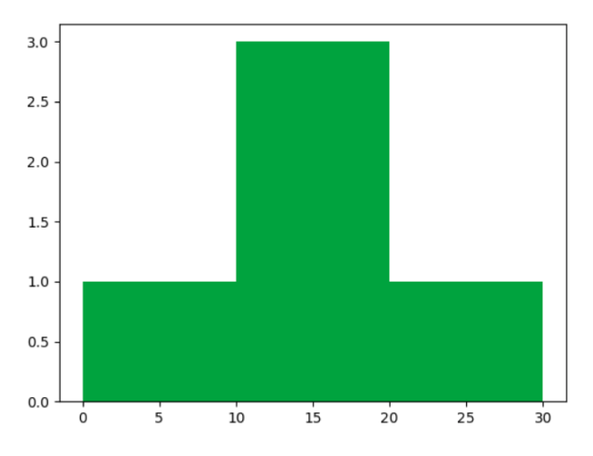
- Only 1 data point (i.e., 5) from the array data lies between the bin edges 0 and 10
- 3 data points (i.e., 10, 15, 18) lie between 10 and 20, and
- 1 data point (i.e., 20) lies between 20 and 30.
Example: NumPy Histogram
import numpy as np

# create an array of data
data = np.array([1, 2, 3, 4, 5, 6, 7, 8, 1, 2, 3])

# create bin to set the interval
bin = [0, 5, 10]

# create histogram
graph = np.histogram(data, bin)

print(graph)
Output
(array([7, 4]), array([ 0, 5, 10]))
Here, the histogram() functions returns a tuple of arrays. Analyzing the output, 7 data points from the array data lie within the bin edges 0 and 5, and 4 data points lie within 5 and 10.
Plot the Histogram
We can use the plt() function to plot the numerical value returned by the histogram.
The plt() is a function provided by Matplotlib. To use plt(), we need to import the Matplotlib.
Let's see an example.
import numpy as np
from matplotlib import pyplot as plt

# create an array of data
data = np.array([5, 10, 15, 18, 20])

# create bin to set the interval
bins = [0,10,20,30]

# create histogram
graph = np.histogram(data, bins)
print(graph)

# plot histogram
plt.hist(data, bins)

plt.show()
Output
(array([1, 3, 1]), array([ 0, 10, 20, 30]))

In the above example, we used the histogram() function to calculate the frequency distribution of data and then plotted the resulting histogram using the plt.hist() function from the matplotlib library.